| Graphics on the ARM | |
| Roger Amos |
Adjuncts to Draw
In the wake of the original (RISC OS 2) version of Draw, many software packages were introduced to provide additional facilities. This chapter considers six of them, three concerned with font manipulation.
The characters in the Acorn outline font system, as we saw in Chapter 3, begin their lives as vector graphics, i.e. outlines, although the text that is sent to the screen or printer has normally been converted to sprites. Font manipulation packages extract the outline data from the font files and convert text back to Draw-compatible path objects, i.e. to vector graphics. In Chapter 2 we briefly met a similar text-to-path facility in the RISC OS 3 version of Draw.
The reason for the profusion of font manipulation software is that the font handling facilities of RISC OS 2 were somewhat limited. It is true that characters from any outline font could be reproduced at any size (to the nearest 1/16 pt), with different scaling on the vertical and horizontal axes if required, and in any text colour and background colour. Nevertheless, for graphic design this is insufficient. Even a simple drawing like that in Figure 4.1, which requires text that is both on a slant and rotated, poses difficulties. There was no way in which text could be written vertically or at angles or slanting, upside-down or backwards (i.e. mirror imaged). Nor could it be given a shadow or fined around an arc or a circle. But all these effects and many more became routine with text that had been convened to graphics. Moreover. Draw's path objects allow separate line and fill colours and the line width is adjustable. So text could use two colours - it could even be made transparent, greatly boosting the potential for eye-catching design work. Users of desktop publishing benefited from this kind of operation for fancy titling and display effects, importing the converted text into graphics frames,
You may be tempted to think mat the advent of RISC OS 3 eliminated the need for this kind of software, Not so! It is true that the enhanced font manager in RISC OS 3 can rotate and reflect outline-font-based text without converting it to vector graphics, but if your DTP software was written for RISC OS 2, it may be unable to use this facility or even to reproduce a rotated text object in an imported RISC OS 3 Draw file. And even if you try printing rotated text straight from Draw in RISC OS 3, you may find that your printer driver is unable to handle the transformation and reproduces the text horizontally. It is true that the version of Draw built into RISC OS 3 has its own text-to-path facility which will meet such requirements as text having different outline and fill colours, but many of the more complex manipulations like text on a circular path really demand specialist font manipulation software.
The following font manipulation packages are considered in this chapter: FontFX from The Data Store (now from APDL), Fontasy from ICS (lan Copestake Software), and TypeStudio from Risc Developments (also now from APDL).
Three other specialist adjunct packages are also considered: DrawBender from ICS, a Draw file distortion utility; Chameleon 2 from 4Mation (now from R-Comp), which, as its name suggests, is concerned with colour change; and Placard from ICS which facilitates the handling and printing of large drawings.
FontFX
The oldest and simplest of the font manipulation applications considered here, FontFX, has developed over the years and still has much to offer. The following description is based on version 4.31.
Clicking on the icon produces a dialogue box (Figure 4.2) having a writable icon at the top in which you enter the text you wish to manipulate. The maximum permissible length is 250 characters. Your entry appears in the currently selected outline font which is named in the pane beneath; FontFX defaults to Trinity Medium if available. Clicking MENU anywhere within the dialogue box calls up a four-item menu, the first item being Fonts. This leads to a scrolling list of the outline fonts present. To change the currently selected font you click SELECT on the one you want. The other three menu entries initiate the creation of the graphics, allow you to save a file of your preferences or to reset the system defaults.
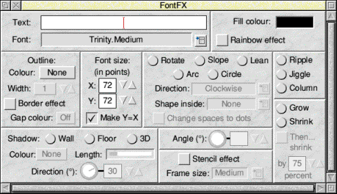
The rest of the dialogue box is taken up by the special effects which can be applied to the converted text. Outline colour and fill colour provide for separate line and fill colours in the converted text, and outline width controls the line width in the resulting path objects; understandably, it is not available if the line colour is set to transparent. Font size allows you to choose the size of the converted text: sizes from 1 to 999 pt are available and separate sizes may be chosen for the x and y axes.
The Stencil effect provides some fascinating effects which otherwise can only be achieved using the Path Merge facility in Vector or the Join Shapes facility in ArtWorks. Essentially it places the text in a box (whose size is controlled) filled with the text fill colour. The text itself retains any outline colour that was selected but its fill colour is transparent, like the holes in a stencil, and of course through it any other objects behind can be seen. A set of patterns, ideal for placing behind stencil text, is provided with FontFX.
In fact each letter is converted to two objects, one having the specified outline colour and width and the other having the depth of the box and the box colour. This allows extra versatility when subsequently processing the stencilled text in Draw.
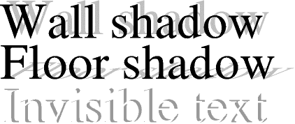
Optionally, your finished text may have a shadow. There is a choice of two shadow types: wall or floor. Clearly these represent the types of 'upright' or 'angled' shadow that would lie thrown on a wall or a floor by your text hanging in space. A wall shadow is also sometimes called a drop shadow. The shadow colour is chosen from the standard palette. There are four possible directions or offsets for each type of shadow: NW, NE, SW and SE. While these are self explanatory, the SW and SE floor shadows do of course appear to fall in front of the text and in this respect are similar to the reflections offered in some other packages.
Incidentally, you get some fascinating effects by making the text invisible (set both outline and fill colours to the intended background colour) but give the shadow a different colour. Shadow can be combined with any other effect including stencil. Figure 4.4 illustrates some shadow effects. Once you have imported your converted text into Draw you can even give the shadow its own outline colour if you wish.
Three effects are offered in which characters are displaced vertically. Column simply assembles the text as a vertical column or stack of single characters, neatly centred. Ripple mounts the characters horizontally but with gradually undulating displacement as though floating on a gentle sea. Jiggle is the same effect, but the -waves are shorter, indeed distinctly choppy. These effects are shown in Figure 4.5.

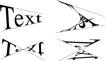
Next are a group of effects in which the characters are slewed through a specified angle; you can adjust the required angle in steps of 1 degree. Rotate simply rotates the entire converted text through the specified angle (always anticlockwise - for clockwise subtract the required angle from 360); the effect is the same as if the finished object were rotated in Draw. Lean leaves the horizontal strokes of the characters horizontal but rotates the vertical strokes; oblique strokes are affected pro rata. The text looks as if it's leaning into the wind; this allows you to create oblique effects. A combination of Lean and Rotate (the rotate must be applied later in Draw as you cannot combine effects within one group in FontFX) allows the creation of perspective effects (an example was shown in Figure 4.1). Slope is the opposite of Lean: verticals remain vertical, but horizontals are rotated, making the text look as though it's climbing a hill. Figure 4.6 shows these three effects.

The last group of effects write the text in a circle or an arc, that being part of a circle. There are options for writing the message clockwise around the top, anticlockwise around the bottom or a combination of both. Optionally you may enclose one of four shapes in the centre of the circle. And there is an option to replace spaces in the text by raised dots. If you want more interesting effects, try one of the circular options combined with floor shadow.
When you have set up your requirements, you click on the Create option in the main menu. After a few seconds a preview window opens showing the created graphics and, usefully, giving its aspect ratio (ratio of width to height). Clicking MENU over the preview window produces a save dialogue box; the graphics are exported as a file which can be dragged into an open Draw window, dropped on to the Draw icon to open a new window, dragged into a graphics frame in a DTP application or saved to disc for later.
One word of warning to those who are new to this kind of operation: converted text files take up far more memory space than plain text objects. Figure 4.7, for instance, is 43 KBytes long.
Recent versions of FontFX can use an effect description language. This allows you to store frequently used transformations as text files and drag them into the FontFX window in order to set up the specified combination of effects.
Fontasy
Fontasy from ICS offers a wider range of facilities and effects than FontFX. The inevitable penalty is that more thought is required to master the possibilities it offers, but it contains many delightful, sophisticated features. It is a package for the perfectionist, whether professional or enthusiast.
Clicking on the Fontasy icon produces the simple dialogue box shown in Figure 4.9. You enter your wording, up to 256 characters long, in the writable icon where, in the latest versions of the application, it is displayed in the currently selected font. Clicking MENU in the dialogue box produces a scrolling list of the outline fonts available; click SELECT on the font of your choice. The currently selected font is displayed in the window; the default is Homerton Medium (if present). A writable icon allows you to enter the required font size; the default is 100 pt, but you can specify size in inches, millimetres or centimetres if you prefer. A toggle icon sets or resets a 'Smart quotes' facility. If set, this changes plain single or double quotes typed at the keyboard to the more attractive open and closed quotes in ASCII codes 144, 145, 148 and 149. When all is ready you click on the OK icon to convert the text to graphics. This opens a display window like the one shown in Figure 4.10. In fact the display window takes one of three forms: the 'original' window, the 'structure' window and the 'full' window. You can cycle between the three by clicking ADJUST on the close icon.
The original window, as its name suggests, displays your message in the chosen font and style, but shown as an outline only. Apart from one or two text manipulations such as kerning and scaling, this display never changes. And herein lies a valuable feature of Fontasy. If you dislike some effect that you have tried, you can cancel it instantly by returning to the original; you can then try something else.
The structure window also shows text in outline form but reflects the various distortions and manipulations that the package offers. And the full window displays the text in its finished form with colours, shadows and other effects that have been selected.
A limited number of manipulations on individual characters is available within the original window. Click SELECT to select an individual character; click ADJUST to add other characters to the selection or to cancel select. Selected characters, highlighted in red, can be dragged with SELECT: they can lie scaled or reflected by dragging with Shift held down and they can be rotated by dragging with Ctrl held down. But note that a system of locks (Lock entry on the main menu) by default prevents dragging in the y-axis (vertical). The Aspect lock constrains scaling to the same scale in both x and y axes so that characters maintain their original shape. These locks may of course be cancelled to allow otherwise illegal manipulations.
Clicking MENU in any of the display windows produces a long menu of manipulations which affect the whole converted text. The first option, Line, gives the choice of line, colour, width and join styles with which we are familiar from Draw except that thin lines are not available. Fill gives a choice of fill colours. Colour selectors in Fantasy offer full 24-bit colour plus transparency. Distort leads to a menu of three options: None, Rotate and Lean. None simply cancels any distortion already introduced and restores the text to its original form. Rotate and Lean both prompt you to enter either one angle or two angles. If you enter one, it is applied to every character; if you enter two, one will be the start value applied to the first character and the other will be applied to the last character-a gradation is applied through the text. This allows some interesting effects, especially if the angle is negative at one end and positive at the other, as in Figure 4.11. Rotation rotates every character individually, although the line of characters remains horizontal. Lean holds the horizontal strokes and rotates the verticals by a maximum of 85%. Note that in Fontasy all angles specify clockwise rotation.
Path relates to the shape of the hypothetical path on which the characters sit. The None option turns any path effects off and restores the original. Slope simply rotates the whole line of text and the characters. To get the 'hill-climbing' effect of the similarly named effect in FontFX you would need to use Slope in conjunction with the Rotation effect to keep the characters upright. Within a submenu from Slope are two useful further options: Length prompts for a length for the slope and rescales the text to suit the specified length. If the Justify toggle is set, however, the text is not scaled, but the characters are spaced out to fill the width-see Figure 4.12. The Column option gives text in a straight vertical column as in FontFX.
The Arc facility is very versatile indeed, effectively combining the Arc and Circle functions seen in FontFX. The dialogue box prompts for the angle, the centre and the radius of the arc. Toggles prompt for Exterior and Interior (which are mutually exclusive) and Justify. The angle is the angle subtended at the centre: entering 360 will of course give a complete circle. The radius is the distance from the arc to the centre of the imaginary circle of which it is pan. You may enter an angle and allow Fontasy to calculate the radius or vice versa; Fontasy bases its calculations on the length of the text and the size of the selected font. Alternatively you may specify both angle and radius whereupon Fontasy will scale the text to fit the arc or justify the text to fit, if you selected the justify option. Centre is also an angle-it is the offset from vertical to the centre of the arc. If you enter 0 the arc will be at the top of the imaginary circle; if you enter 180, it will at the bottom and the text (or some of it) will be upside-down. The smaller the radius, the tighter will be the arc. Exterior and Interior are the direction of the text: Exterior text reads clockwise and Interior text reads anticlockwise.
The Draw option allows you to import a path object from Draw and use this as the path along which text is fitted. A dialogue box allows a versatile choice of which part of the path to use and x-scale and y-scale values can distort the path. A reverse option runs the text backwards along the path and a justify option will space out the text to fit the length of path specified. Some examples are shown in Figure 4.13.
The Shadow option allows three types of shadow and a none option that turns all shadows off. Drop shadows (wall shadows in FontFX) and Floor shadows are both provided. Usefully in these the angle of offset and the distance between the text and its shadow can be specified; they can even be graded like the lean angles, providing some interesting effects (Figure 4.14). Block shadow gives a three-dimensional effect, like characters cut out of a block of thick material.
The remaining items on the main menu are concerned with scale, locks, zoom, display option and saving work. Fontasy will save its artwork as standard Draw files or as a script file, that is a special text format which also saves the menu options so that you can break off a design session and resume it later. By dropping the script file on to a different Fontasy window, you can force the effects described in the file on to the text in the window.
Typestudio
Typestudio from Rise Developments (now from APDL) is in some ways more comprehensive than Fontasy and in other ways less so. Clicking on its icon instantly reveals its most significant difference from the two previously considered applications: it bears a striking resemblance to Draw (Figure 4.15); it has many of the facilities of Draw and to a limited extent can be used as a stand-alone package. While FontFX and Fantasy can display their graphics only in isolation, Typestudio allows you to see them and manipulate them in relation to other graphics, but only if they are path objects.
To be precise, Typestudio has only a cut down version of the vector graphics facilities of Draw. It can create open-path objects consisting of lines and curves, hut not moves. It cannot create closed paths except in converted text, It cannot create text objects, text entry being always converted to path objects. But this does not really matter since these facilities are provided only to allow you to to tidy up converted text and, more importantly, to create moulds and paths (more on these later) without having to load Draw. On a 1 MByte machine you could not have Draw and Typestudio loaded simultaneously. Other types of object are not supported. If you load a Draw file containing sprites, text objects or text areas, these are not displayed.
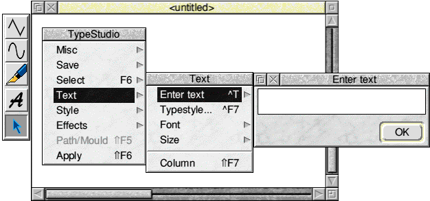
Using Typestudio is essentially a two-stage process. Firstly you convert your text to graphics. Secondly you perform one or more manipulations on the text-become-graphics. From the main menu you select Text to enter your text: a dialogue box also allows you to choose your font and size; in the writable icon your text appears in the selected font. Clicking on the OK icon generates the graphics within the window. A column option, if set, forces the text into a vertical, neatly centred column.
In most respects the application closely follows Draw's object-based philosophy. You can select one or more objects in the normal way. A select menu like that in Draw allows you to group and ungroup objects, drag them, scale them, rotate them and from the Style submenu you can impose on your selection the same styles of line colour, fill colour and (out)line width that Draw offers. 24-bit colour (plus transparency) and thin lines are available.
The five options in the effects submenu (shadow, slant, mirror. 3-n and plinth) are a little more complex. 'The converted text must he selected, all preferences set and the effect ticked in the effects menu. Then you click on the A (Apply) icon in the toolbox or on the Apply option in the main menu and the effect is applied.

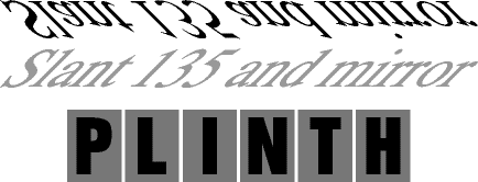
Very fine control of effects is provided. For instance, for shadows there is not only the same style choice as for the text itself (separate fill and outline colours and line width) but three types of shadow: besides the now familiar wall and floor shadows there is a graduated shadow (Figure 4.16), effectively a series of shadows whose colour diminishes as they recede into the distance. Shadow angle and distance (height in a floor shadow) are both user-defined-the floor shadow can even be in front of the text if its angle is between 90 and 270 degrees. Slant simply leans the text, there being no limit to the lean; between 90 and 270 degrees the text is of course 'head over heels'. Mirror is effectively a variant of shadow except that the reflection is not hidden by the text; there is a choice of mirror positions (Above, Below, Left and Right), a user- definable gap between text and reflection and a full set of styles for the reflection. 3-D is similar to the block shadow in Fontasy with a choice of angle, distance and styles for the 'depth'. Plinth is unique to Typestudio. It stands each character in the centre of an identical rectangular block having user-defined characteristics. Beware! This effect strips ordinary spaces out of the resulting graphics and if you think you can use a NBSP in place of a space, you can't-it replaces the NBSP with a full stop. Other characters with codes above 128 are handled normally. Figure 4.17 shows some of the effects possible.
Typestudio contains no explicit provisions for text on arcs or circles. But it does contain a text- on-a-path facility similar to that in Fontasy. So you draw your arc or whatever shape you wish using the drawing facilities-or import a ready- made one-select your path object in the normal way and click on the Path/Mould option in the Select menu. This changes to read simply Path and a tick appears beside it to show that a path is active. The path itself is now shown in a grey dotted boundary box to indicate that it is the active path. Provision is made for text of preset size to be placed at the left, right or centre of the path or scaled to fit it or simply stretched to fit. You can apply a path retrospectively to text that has already been converted by selecting the text and clicking on the Apply icon; alternatively while the path is active any new text converted to graphics will be forced on to the path.
There is one other important facility which Typestudio offers: moulds. The term mould used in this way originated with 4Mation's Poster and is also used in DrawBender. It is a device for distorting a graphic in a controlled manner.
If you draw two path objects, select both and then click on the Mould option on the main menu, they form a special kind of group called a mould, identified by a grey boundary box. As with a path, new text converted to graphics while the path is active will be distorted into the shape of the mould and existing text that has been selected can be forced into an active mould using Apply. If the two path objects cross each other or run in different directions, amazing contortions are possible (see Figure 4.18).
One more interesting point about Typestudio is that all of its special effects are applied to graphics, i.e. to path objects which may well be in the shape of text, because we took pains to convert them from text. But they can equally be applied to other path objects or groups of path objects. It can just as well add a shadow to a tree or a reflection to a bridge or, using the 3-D effect, change a square to a cube!
DrawBender
DrawBender from ICS is a path-object distortion application often used in conjunction with Fontasy from the same source. Used together the two applications offer similar facilities to those of Typestudio.
It is a very simple application to use. Clicking on the icon opens two plain windows labelled Object and Mould. Into the mould window you drag a path object which you created in Draw or loaded from disc. In DrawBender a mould consists of a single closed-path object having at least four segments and created working clockwise. A directory full of suitable objects is supplied with the application. Four of the points in the mould must lie designated as the four corners for your transformation; if the mould has more than four points you must choose (by clicking SELECT on them) the four to be used. To guide you a set of dots is displayed which represents the distortion of a rectangular grid that would be produced by application of the mould as currently set up-see Figure 4.19. You should choose a selection of points that keeps the dots within the mould's outline, otherwise you are likely to end up with a very tangled transformed drawing.
Drag into the object window the path object or group of path objects which you may wish to transform. It need not necessarily be the same order of magnitude in size as the mould, since the application will rescale the drawing as appropriate. Then click on Process in the mould window menu to start the transformation process. The time taken depends on the complexity of both mould and object; for complex objects it can take many minutes and there is a fast option available which produces a faster but less accurate result. The transformed object will appear in the object window and a save option allows you to save the result to disc or to another application. Figure 4.20 shows the result of a comparatively gentle transformation! Both windows have a zoom option.
Chameleon 2
Appropriately enough, Chameleon is concerned primarily with colour change. A recent major revision of this package from 4Mation, Chameleon 2, offers greatly enhanced facilities including the luxury of graduated colour fills. It also offers a number of other valuable facilities, including the production of CMYK separations (Cyan/Magenta/Yellow/Key separations as used in the print industry- Key is black). The version described here is Chameleon 2 tested on an A5000,
In Draw it is not easy to change the colours of an object. First you must select the object (which may necessitate ungrouping it), then you call up the Style menu, select line colour, fill colour or text colour and then select either one of the 16 palette colours or manipulate the sliders until the RGB content is correct (even though you may not be able to see the resultant colour on the screen). Chameleon only requires you to select a colour and click the pointer over the object you wish to recolour. In practice it offers many more sophisticated options than just this. In fact, it makes possible in Draw files some of the image processing that is normally only possible on pixel graphics.
What Chameleon will not do is to operate interactively with Draw, so you cannot use it to edit the colours of artwork currently in Draw, you must transfer the drawing from Draw to Chameleon. Although I have referred only to Draw as the originating package for the drawings on which Chameleon operates, it does of course work equally well on Draw-compatible files from any source. It also accepts files from Poster and files in 4mation's compressed Draw format; it will also save files in this format. If you import files from DrawPlus or Vector it will display objects on all layers, but it will not display objects of unfamiliar types such as Vector's replications.
You start up Chameleon by dragging a file icon on to the application icon. This opens two windows, one displaying the artwork being edited and the other, shown in Figure 4.21, displaying the tools. You move the pointer in the drawing window to indicate the object you wish to edit. The 'lens' in the bottom left-hand corner of the tool window gives a magnified image, the circle in the centre identifying the pointer position with pixel accuracy.
There are five options for identifying the target object: Local affects only the object immediately beneath the pointer; Global affects all objects beneath the pointer and all other objects having the same colour. The other three options require you to drag a box in the drawing window. Within box affects all objects totally enclosed by the box. Beneath box affects all objects overlapping the edges of the box. Not within box is applied globally to all objects in the drawing except those totally enclosed by the box. It follows that there is no way you can change the colour of a single object that is wholly hidden behind another, but since such an object cannot be seen, why should its colour matter?
Chameleon disregards groups and layers. You can change the colour of an object even if it is part of a group or on an unselectable layer (see Chapter 5 for more on layers). You can also change the colour of text in a text object or a text area and you can change the colour of sprite objects in Draw files, Note, however, that each colour in a sprite behaves as though it were an object. If, for instance, you replace a black pixel by blue, you will find that every black pixel in the sprite has been changed to blue. You cannot change a fill colour or line colour which is currently set as transparent.
You choose the replacement colour by clicking on the Colour select icon at the bottom right of the tool window. This calls up a standard 24-bit plus transparency, three-slider colour selector. But this can also be supplemented by a 256-colour palette (like the one used in Paint in 256-colour modes), a 256 grey-scale palette or a 24-bit RGB colour cube (illustrated in Figure 5.6). Of course, the 256-colour palette only appears in 256 colours in 256-colour modes. The 256 grey- scale palette will appear to be in 16 shades of grey in 256-colour modes in RISC OS 2, but in RISC OS 3 dithering gives some extra shades. In RISC OS 3 the RGB colour cube appears to give almost 4096 colours in 256 colour modes, but some adjacent dither patterns are barely distinguishable. The colour cube is certainly a powerful means of selecting colours. You begin by selecting the reel content from the scale beside the cube: this selects the 'slice' within which you move the pointer to the right to increase the blue content or upwards to increase green content.
You can also copy a colour off an object in a drawing by clicking ADJUST over it. This makes it easy to copy one object's colours to another.
Chameleon offers far more than straight replacement of the former colour by the chosen colour. There are seven alternative colour replacement operations. To understand some of these we need to digress into the HSV (hue, saturation, value) system of colour specification which is based on the way the human eye perceives colour. The hue is the actual colour (wavelength), e.g. red or green. The saturation represents the amount of white that is added to the hue; the less white, the higher the saturation. The value (sometimes called volume) represents the brightness of the colour, effectively the inverse of the level of black in it.
The first operation is the simple replacement of the original colour by the one chosen. The second changes the hue of the chosen colour, but leaves the saturation and value levels unchanged. The next changes to a shade of grey (effectively removing the hue). Brighten increases the brightness (value) by reducing the black content. Darken reduces the value, increasing the black content. Weaken increases the amount of white, i.e. decreases the saturation. Strengthen increases the saturation by reducing the white content. In this way you can easily fine-tune the colour of any object.
If you make an unfortunate change you can restore the original by pressing F8. Up to 256 colour changes are stored in the undo buffer. Chameleon 2 has separate icons which allow you to select whether you are working on line colours or fill colours.
One of the most exciting aspects of Chameleon 2, however, is its facility for 'fountain fills', otherwise called graduated fills. In these an object is given not a plain fill colour, but a range of fill colours which can suggest sheen or shading and hence texture. Careful use of fountain fills can make your Draw graphics look like ray-traced sprites! The option works best on screen if you have RISC OS 3 and can make use of its dithering facility. Four fountain fill options are provided. In a Linear fill the object is a filled with a band of colours merging from a start colour to an end colour. The direction of the band and start and end points can be controlled by the user. A band fill is similar, but the fill extends in two directions, the start colour being in the centre and the end colour being at either side. The angle of the banding, the width of the start band and the two end points can all be controlled. The Radial Fill effectively provides concentric circles with a gradual range of colours. 'The positions and sizes of the innermost and outermost circles can be controlled. The elliptical fill is similar, but the width and height of the ellipse can be controlled.
Soil effects are made possible by fountain fills. In practice, the fountain fill consist of a series of intermediate objects having intermediate fill colours; the interpolate/ grade/blend facilities in Draw 3 and some other packages can also be used to create this kind of effect. When you transfer a drawing containing a fountain fill to another application, there may be limits on the further processing that may be applied to the fill. In Draw you will be able to move and scale fountain-filled objects. You will not be able to re-edit the fountain fill in Chameleon unless you chose an option that stores additional data in the file, but these additional data can cause problems when fountain-filled objects are processed by some other applications.
Chameleon offers the option to save not just Draw, compressed Draw and Poster files, but also to produce colour separations. These may be CMYK separations of material for commercial full-colour printing or spot colours. In spot colours, a separate drawing is created for each colour used (maximum 64). The separations are saved as separate files within one directory. Crop marks can be automatically placed on the colour separations lo aid registration.
Placard
Placard from ICS is the last of the adjunct applications considered in this chapter. Draw is capable of handling of drawings as large as size A0 (841 x 1189 mm), but most printers will handle only a nominal A4, some a nominal A3. Consequently the printing of very large drawings is complicated. Of course, by selecting all and grouping, you can drag the entire contents of the drawing so that each A4-size portion of it is in turn brought within the print limits window and printed, That, however, is a clumsy process and joining together the various sheets that emerge from the printer is not easy. Placard makes the process much easier, but it only works with Draw files, whether created by Draw itself or other applications.
First load your printer driver, since the application needs to know the size of the printable area. Then drag your Draw file on to Placard's icon. This opens a window displaying the drawing enclosed by a solid red boundary box. You will also see a number of dotted red boxes, each representing the area of a printed page. So you will see at once how many printed sheets will be needed for your drawing. You may decide on a preferred orientation, portrait or landscape, for the printouts, or you may leave it to the application to determine which orientation will use the smallest number of sheets of paper.
A zoom facility is provided so you can see the layout clearly, and a scale facility allows you to resize your drawing instantly. If, for instance, your drawing was only just over A4, you could scale it down so it fits a single A4 sheet or you could scale it up to make full use of an A3 sheet or two A4 sheets. It depends on your requirements. A margins facility allows you to reposition your drawing.
A wide range of print options includes the printing of dotted lines and page numbers as an aid to cutting printed sheets and even tabs to help in gluing the printed sheets together.